
In past posts, I have talked about a ‘database’ approach or how an Excel data analyst approaches data in their spreadsheet work or financial modelling. I come from an accounting and commercial background, and in these kind of roles unexpected report output needed mad moments before meetings and weekly and monthly deadlines was your life. So I had to learn over time the better ways to organize data myself. What I mean by organizing your data, is so it can be easily updated, more easily re-used for multiple purposes (multiple reports for instance) and organized so you can take advantage of the power and interactivity of Excel’s Pivot Tables, Pivot Charts and Tables with slicers. I did a recent post on using Pivot Tables – I was a relative late devotee of Pivot Tables. These tools are not only powerful but they save you time and the effort rather than creating and maintaining advanced lookup or aggregating formulas like INDEX + MATCH, VLOOKUP, SUMIF and SUMIFS and SUMPRODUCT.
So to explain my point, let say there is a Office Products business operating mainly on the Gold Coast and in Brisbane. You might see data arranged like this.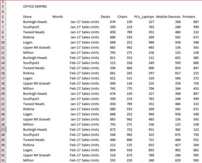
At first glance it might not look so bad. It’s so common to see data this way and probably we have all encountered far worse. But it’s going to be hard work turning this data as is into reports or a dashboard each month.
So I would manipulate and re-organize this data into data sets of stores, products, months and transactions. An Excel Analyst knows he can do so much more magic if the foundations of the financial model i.e. the data are organized correctly.
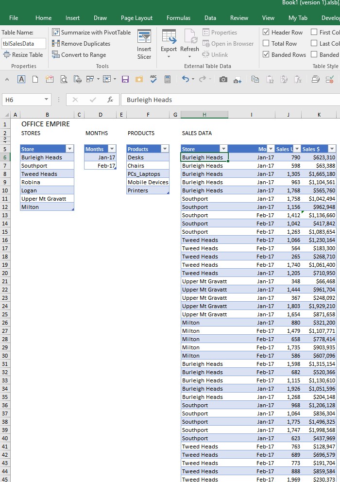
In this simplified case, by ‘transaction’ I mean a month’s sales. In reality I would want each day’s sales granularity so that any analysis can be done such as good and bad trading days. And you will note the data is in Excel Tables – tables are the best thing to happen to Excel since Pivot Tables (introduced in 1997 way before smart phones and common use of the internet!) and if you are not using them I urge you to make the change. The case for using them is just a no brainer and soon no one will blog on why because its like justifying using the internet. Tables are great. Structured References used in formulas to reference Table data is awesome. In Tables data updating data and formulas is dynamic (automatic), referencing in formulas or other tools like Pivot Tables to Tables is easier and in Excel 2013 onward you can join data in Tables so you can have the one Pivot Table working with multiple tables of data. Note also, I have named this Table with a prefix tbl + SalesData which I find helps so much in structured references in my formulas but exactly how is a subject of another post.
OK, so I have my data organized in Tables of data and transaction data (Sales Data) has transactions (the months) down the page. Across the page are the different dimensions to this data – in this simple case Sales Units and Sales $. In the real world this would have more granularity but also other dimensions like Sales Units Budget, Sales Units Forecast +++ going across the page. I also have smaller ‘master file’ type data like Products, Months and Stores which can be linked to Validation Dropdowns to ensure consistent data entry. In reality these particular tables would have other related data in each like Product cost, price, tax, supplier and Store would have address, reporting region and details like this attached.
So after doing this the first pay off is we can add slicers linked to our Table placed above our Sale Data Table so we can interactively play with, slice and dice our data – let’s see just Chairs and Desks for Feb 17 across just 4 stores. How good is that!

So then 2nd and 3rd payoffs come because can then insert a Pivot Table and Chart nicely set to the Table Name data source and know they will work without much fuss.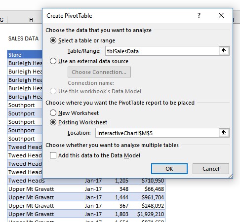
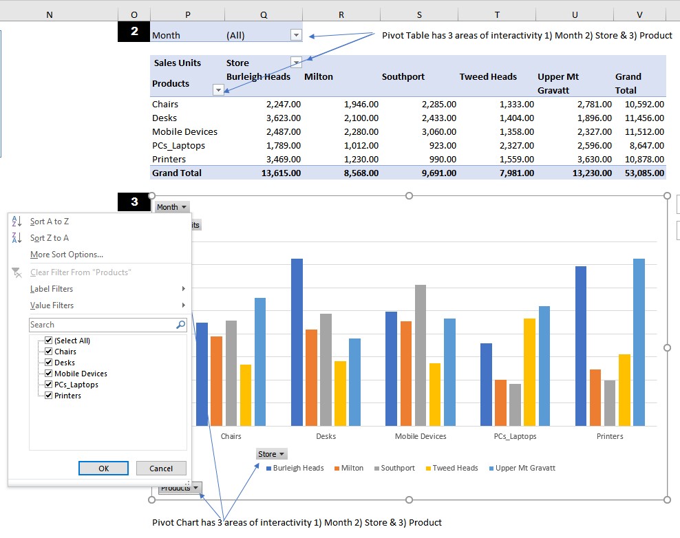 Within one minute we have inserted a nice looking Pivot Table for a report that was the original interactive tool in Excel. One minute later we insert a Pivot Chart, also with the same interactivity. We can now respond to requests for reporting. [Note I have just inserted the Pivot Chart under the Pivot Table for ease of illustration which you wouldn’t do because obviously the Pivot Table needs to expand with different data fields. You would enter them side by side or on another sheet.] If you are creating a dashboard you might take Camera shots of these or perhaps copies of these reporting different things to incorporate into a dashboard. Or you might use this as raw data for a fancier polished tabular visual or chart. I know the formatting of Pivot Tables and Pivot Charts can be frustrating, but the speed, ease and power of this tool simply out do advanced formula alternatives in many cases. I know this from bitter experience as I resisted Pivot Tables for years and years (because of the frustrating formatting mainly) and did analysis work the hard way. I became very strong in advanced formulas but wasn’t getting home on time! With Pivot Tables you have more time doing the real job of analyzing and spend less time on building the spreadsheet.